Case Studies
-

Milwaukee
-

Hoover
-

Nummy Creations
FASTER, CHEAPER, BETTER: BRANDWORKS design SERVICE
Vendor Funded Marketing, Graphic Design & Production, Print Optimization, Project & Client Services Management
Our client, Milwaukee Power Tools, manufactures heavy-duty portable electric power tools and accessories.
Their sales reps were working with distributors around the country on vendor-funded marketing collateral. But the branding was inconsistent, messaging was off, and costs were all over the map.
Milwaukee wanted a consistent brand, online ordering, a way for sales reps to access each other’s promotions, and a better handle on design and printing costs.
We set them up on our white label, highly-customizable online portal. Now reps and distributors can order flyers in minutes by picking products to plug into pre-designed templates. They can also add text and dealer logos, change language, set pricing, view archives, and more.
95% of projects are now done within just 2 business days – and they’re on brand and on message, every time. Design and printing costs are down $15,000 to $20,000 a year.
And Corporate keeps their finger on the pulse with quarterly dashboards packed with useful insights that help them better support their sales force.
SALES MADE SIMPLE: PROMO BUILDER
Vendor-Funded Marketing, Graphic Design & Production, Print Optimization
Milwaukee’s amazing quarterly sales promotions – which used to take 60 pages to explain – were overwhelming distributors and jamming up sales reps. Our own ace graphic design team, even, was having trouble keeping track!
We put our problem-solving hats on and created an internal document to speed design work. It was so effective, we couldn’t keep it to ourselves!
Milwaukee loved it, and rolled it out to their entire sales team.
Our design-forward thinking transformed their process, simplified sales, and made it easy to understand everything that’s available.
Now, ordering materials to market the promotions is as easy as putting a few checkmarks in a fillable pdf.
THE PERFECT PITCH: MOCK-UPS & PACKAGING
Graphic Design and Point of Sale
Vacuum cleaner giant, Hoover®, was pitching products to major retailers in Canada and needed mock-ups of new products, packaging, and point of purchase displays to help them seal the deal.
Our design team loves this kind of conceptual work.
Armed with measurements and sizes, we put together planograms that showed exactly how the products would fit into the retail space, created layouts of aisles, designed packaging, and did 3-D renderings for new products, helping them come alive for buyers.
The pitches were a breeze, and from there we took it to the next level, creating the actual packaging, aisle violators, fact cards, danglers, and POP, including end cap POP.
COMPELLING CONTENT: RELATABLE PRODUCT VIDEOS
DEMO VIDEO & PHOTOGRAPHY CONTENT
During the pandemic, Hoover® needed to build a stronger
E-commerce presence for its CanadianTire.ca listings.
We developed compelling demonstration videos and product photography of cleaning up real messes and spills in true home settings with our own team so that it was easy for Hoover®’s target audience to relate to the everyday messes that we all deal with on a daily basis.
LAUNCHING A BRAND: MARKET ANALYSIS & PACKAGING
Brand Development, Packaging, Marketing Analytics
New Start-up, Nummy™ Brands is entering the market as a Dandelion Coffee Alternative (DCA) in a direct competition with Dandy Blend, the leading DCA on the market. Consumers generally switch to a DCA when they are experiencing health issues like jitters, anxiety, insulin crashes or are looking to reap the many health benefits that DCA has to offer.
Nummy™ wanted to create a DCA that tasted more like coffee with a variety of delicious flavours.
Our team performed a full market analysis on the DCA industry and found that the majority of packaging lacked an understanding of all the great drinks and recipes that you can create, while their social accounts showcased fun and aspirational drink recipes.
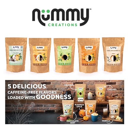
Our goal with the design was to bring in the aspirational feel right on the package. The bright vibrant colours, ingredients for each of the flavours and fancy drink recipes are split so that consumers are inspired to take their DCA from a straight black to a ‘Nummy’ latte or frappe.


